Tripadvisor Experiences
Tripadvisor Experiences
From hard sell to helpful guide
From hard sell to helpful guide
Company: Tripadvisor
Teammates: Alec Wong, Shahina Khanna, Jia En Koh, Emma Ryan
Company: Tripadvisor
Teammates: Alec Wong, Shahina Khanna, Jia En Koh, Emma Ryan
Duration: Q2-Q4 2021
Deliverables: Full-funnel redesigns for web and app, prototypes, UX research, competitive audits
Duration: Q2-Q4 2021
Deliverables: Full-funnel redesigns for web and app, prototypes, UX research, competitive audits
Background
Background
Between 2021 and 2024, Tripadvisor’s "Things to Do" segment accounted for 19% of the company's total revenue, making it a critical pillar of the ecosystem. However, user data revealed a significant gap: while the platform received over 40 million monthly visitors, a mere 13% of that traffic actually converted into bookings. Internal discovery research highlighted that 85% of traffic arrived via SEO, with 43% of users strictly looking to do research and 27% seeking to understand a destination, rather than immediately buying.
Between 2021 and 2024, Tripadvisor’s "Things to Do" segment accounted for 19% of the company's total revenue, making it a critical pillar of the ecosystem. However, user data revealed a significant gap: while the platform received over 40 million monthly visitors, a mere 13% of that traffic actually converted into bookings. Internal discovery research highlighted that 85% of traffic arrived via SEO, with 43% of users strictly looking to do research and 27% seeking to understand a destination, rather than immediately buying.
Problem
Problem
The legacy platform design was actively working against natural traveler behavior. The page was heavily optimized for commerce and immediate bookings, ignoring the "underserved majority" who were still in the early stages of trip planning. Content sequencing lacked a data-driven approach, resulting in extreme visual noise, a diluted content hierarchy, and an aimless navigation flow. Users reported feeling overwhelmed by the density of the hard sell before they even had a sense of the place they were visiting.
Strategy and Execution
Strategy and Execution
The design team hypothesized that strengthening destination context, creating structural distinction, and prioritizing discovery pathways would naturally lead to higher engagement and conversions. They mapped an ideal traveler journey transitioning from "Get trip inspiration" to "Get a sense of place," before eventually moving to "Discover," "Find," and "Shortlist & Compare". During testing, the team evaluated modules based on performance, finding that "Popular Things to Do" aided early-stage planning, while "Top Attractions" drove over 60% of clicks by bridging discovery and booking. A key A/B test pitted a commerce-heavy layout against a destination-context layout, eventually leading to a balanced, user-first variant that satisfied both business and traveler needs.
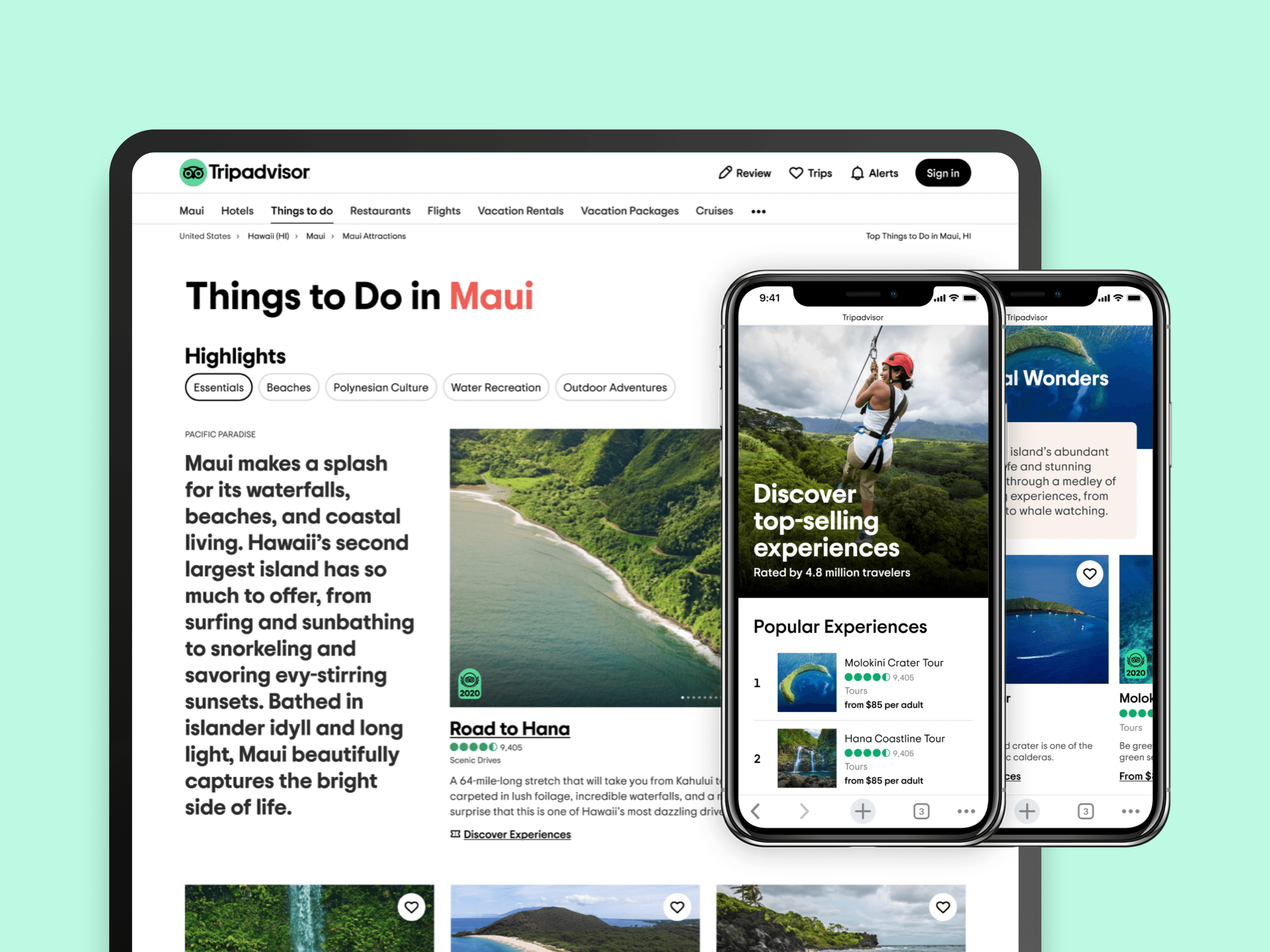
The shipped product utilized a scalable, three-tier framework: Understand, Explore, and Consider.
Establishing Destination Context (Understand): The page introduced geographical clarity by layering City, Region, and Country hierarchies. It utilized AI-generated summaries of user-generated content to define the "vibe" of a location, explicitly stating what a city was known for right at the top of the funnel.
Categories and Curations (Explore): Instead of wall-to-wall product listings, the redesign introduced breathable category pills (e.g., Beaches, Polynesian Culture) and curated shelves like "must-dos" and "top things to see," which allowed users to navigate based on interest rather than just price.
Magazine-Style Highlights (Consider): The team introduced immersive, magazine-style layouts that broke destinations down into 1-3 major themes (e.g., Tropical Paradise, Natural Wonders). These sections paired rich video headlines with highly relevant, top-selling experiences, balancing engagement with commercial intent.
Impact
Impact
The strategic shift paid off across all key performance indicators. On the business side, the redesign drove an 8% increase in net revenue and a 7% increase in total bookings. Engagement metrics saw a 6% boost in detail page views, a 0.5% increase in active minutes, and a 1.5% reduction in bounce uniques. Qualitatively, user feedback shifted from complaints like "I feel overwhelmed" to praises such as "I know where to start," with users explicitly noting that the interest-based groupings saved them from visiting multiple competing websites.
The strategic shift paid off across all key performance indicators. On the business side, the redesign drove an 8% increase in net revenue and a 7% increase in total bookings. Engagement metrics saw a 6% boost in detail page views, a 0.5% increase in active minutes, and a 1.5% reduction in bounce uniques. Qualitatively, user feedback shifted from complaints like "I feel overwhelmed" to praises such as "I know where to start," with users explicitly noting that the interest-based groupings saved them from visiting multiple competing websites.